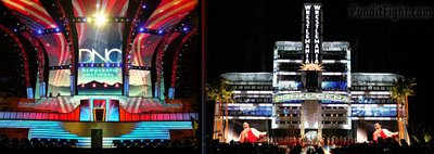
The stage design for the Democratic convention has been unveiled. The extravagant set is reminiscent of WWE's PPV ring entrances.
I don't know why the DNC took this approach in it's design but I would assume it's the same reason wrestling does it - Showbiz!
A commenter from Digitaljournal.com has an interesting take on it.
Ok.. I give them both credit for looking great. The DNC is the most elaborate and showy, The RNC's is a very clean to the point style. Now for the conservative view...
It seems that the DNC's is something that would better fit a Hollywood awards show or American Idol etc..with all the glitter and glam. I would hate to even guess how much cash the stage cost to build. It seems to reflect the superstar persona that has been attached to Obama as seen in McCain's add with Britney and Paris right along with what almost every radio personality has said about him! Why would Obama and the DNC want to further support this image? It too me shows the complete exuberant heavy handed spending of funds on not so essential things. Not to mention what Denver is doing alone on the street level.
As for the RNC's stage It looks as though they could have added just a bit more to it somewhere, but it is a clean and precise no nonsense styling. But a little flourish would have helped.
I will give the DNC a 10 out of 10 in just pure creativity and looks and the RNC a 7.
It sends a message of how you can expect each side to spend your cash though in my honest opinion.
Posted Aug 22, 2008 by RCB2875
Read the DigitalJournal post and user comments - Democrats and Republicans Unveil Convention Podiums
Expect a future post on the nexus of Hollywood glitz and Politics - The Flight Suit and the making of a Hollywood President.
No comments:
Post a Comment